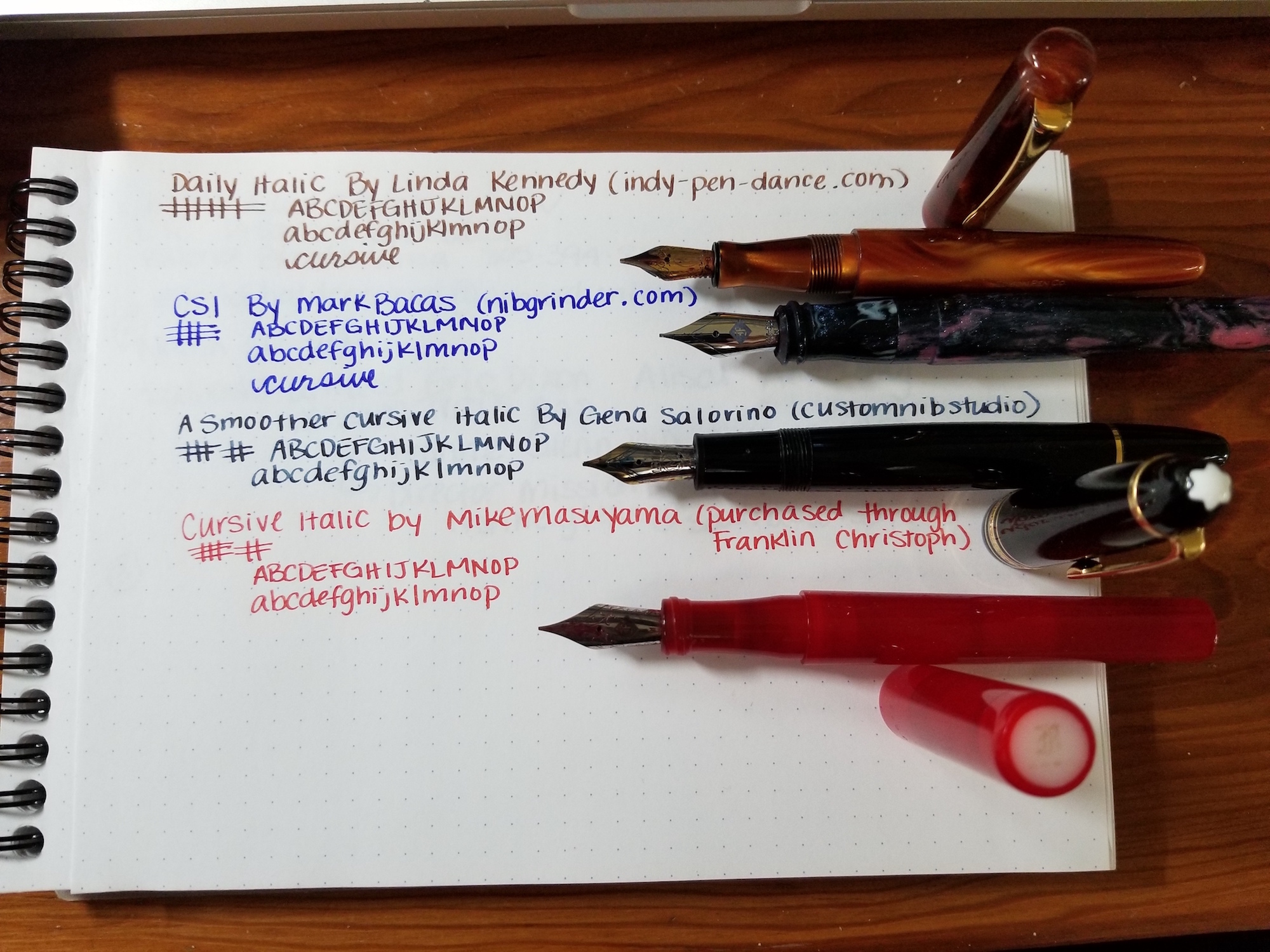
One of the things that makes fountain pens extra special is the ability to customize the grind on the nib, so that your pen writes in its own unique way that suits you. My first experience with a grind was when I purchased a Model 03 pen with a cursive italic grind straight from Franklin Christoph at a show, and it was tuned to my liking by the late, great Jim Rouse, so it has ended up working well for me. Franklin Christoph does a really nice job of letting you try multiple pens and nibs and scribble until your heart’s content.
I wanted to show the difference between different cursive italic nibs from different nibmeisters or nib grinders — whatever we call these wizards with grinding tools, great eyesight, and steady hands these days. Cursive italics are like traditional italics, but they are a little bit more smooth and forgiving. Mark Bacas, aka Nibgrinder, has a good graphic that illustrates and explains different nib grinds.
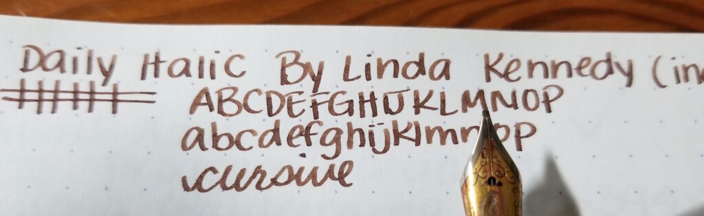
The first that is pictured is by Linda Kennedy, and it’s her DailyItalic. This grind was recommended because I do a combo of printing and cursive writing, although I mostly print. Linda describes this grind as being better suited for someone who tends to print since people who print use more pressure. It’s a cross between a stub and a cursive italic, but there’s still line variation. The original nib was a steel broad.
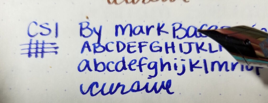
The next grind from the top is a CSI by Mark Bacas, which is his cursive smooth italic that he describes as his special version of the cursive italic. This was done on a Franklin Christoph gold nib in medium. Mark has done a bunch of different grinds for me, and I’m comfortable with his work. The CSI is one of his specialties. I really like this nib, but it’s slightly more sharp than Linda’s. However, it still works for my writing.
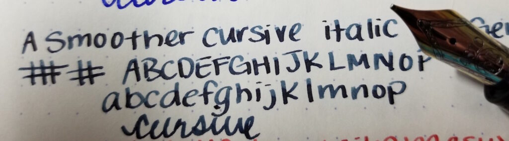
The third grind is a smoother cursive italic from Gena at Custom Nib Studio. I asked her to make this a little more on the smooth side, and she delivered. This is a gold nib on a Montblanc 146 that was purchased used at a show. I don’t know the original nib size was, but it was on the broader side and kind of wrote like a Sharpie before I had it worked on. Montblanc is known for having a generous amount of tipping material. Initially, this nib didn’t have a lot of character, but I reach for it more now.
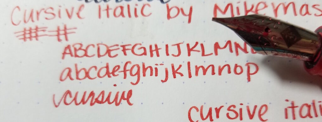
Then the last nib is a cursive italic from Mike Masuyama, which came with the pen I purchased from Franklin Christoph. I’m told that the grinds that Mike does for Franklin Christoph are a little more forgiving so they will work for more customers. This one is very smooth and enjoyable to use, and as mentioned above was tuned at the table when I purchased it. It’s a steel medium nib.
If you like a little flair in your writing and write in a cursive-ish style, or even print, you might want to try a cursive italic. The smoother cursive italics are easy to write with quickly, especially if you do print. I haven’t really had any issues with any of these nibs.